Web
Enterprise

About the project
Intel® Network Builders is a global partner initiative connecting businesses, developers, and industry leaders to accelerate enterprise innovation. The platform is where partners discover Intel technologies, access technical documentation, complete training, and engage with community resources across multiple industry verticals.
The Challenge
The existing Intel Network Builders website had grown organically over time, resulting in a fragmented, outdated experience that no longer reflected Intel's enterprise positioning or served the needs of its technical partner audience.
Core Problems Identified
Static, outdated homepage with no dynamic content updates — making it impossible to surface relevant news, events, or partner spotlights in real time.
Weak navigation with no clear information hierarchy — partners struggled to move between communities, technologies, and learning resources without getting lost.
No personalization layer — all users saw the same generic experience regardless of their industry vertical or role.
Outdated visual design — the UI no longer aligned with Intel's current brand standards or competitive enterprise platform expectations.
Poor content discoverability — technical documents, university courses, and solution resources were buried and difficult to surface efficiently.
Fragmented community structure — existing communities lacked consistent design patterns, making cross-community navigation confusing.
The business impact was tangible: partner drop-off, underutilized resources, and growing feedback from the Intel ecosystem that the platform felt dated and hard to navigate.
My Role
Ownership | UX strategy, heuristic audit of the existing site, information architecture, wireframing, UI design across all pages, design system alignment, responsive design, and developer handoff. |
Collaboration | Intel stakeholders, OnSumaye product managers, and the development team. |
Outside my scope | Intel brand guidelines (pre-defined), backend development, and content strategy / copywriting. |
I led the design end to end as the primary UX/UI designer on the project — from discovery and IA restructuring through to final high-fidelity UI and handoff. This was a client-facing project delivered through OnSumaye Solutions.
Research & Discovery
Methods Used
Heuristic evaluation of the existing Intel Network Builders website
Stakeholder interviews with Intel product and content owners
Competitive analysis of enterprise partner portals and developer platforms
Content audit — mapping existing pages, sections, and resource types
Navigation and IA review — identifying structural gaps and dead-end flows
01 | Navigation was the biggest barrier — not content. Partners had difficulty moving between communities, technologies, and learning resources. The site structure didn't reflect how users actually thought about Intel's ecosystem. |
02 | Static content was eroding credibility. The homepage surfaced outdated content with no mechanism to highlight current events, new solutions, or partner spotlights — making the platform feel neglected. |
03 | Community pages lacked consistency and depth. Each community (Network, Industrial, Retail, Healthcare, Video & AI Cities) had been designed independently, creating an inconsistent experience and missing cross-community discovery opportunities. |
04 | Resources were hard to find, not hard to create. Intel had strong technical content — courses, solution briefs, webinars — but partners couldn't surface it reliably. Discoverability, not content volume, was the root problem. |
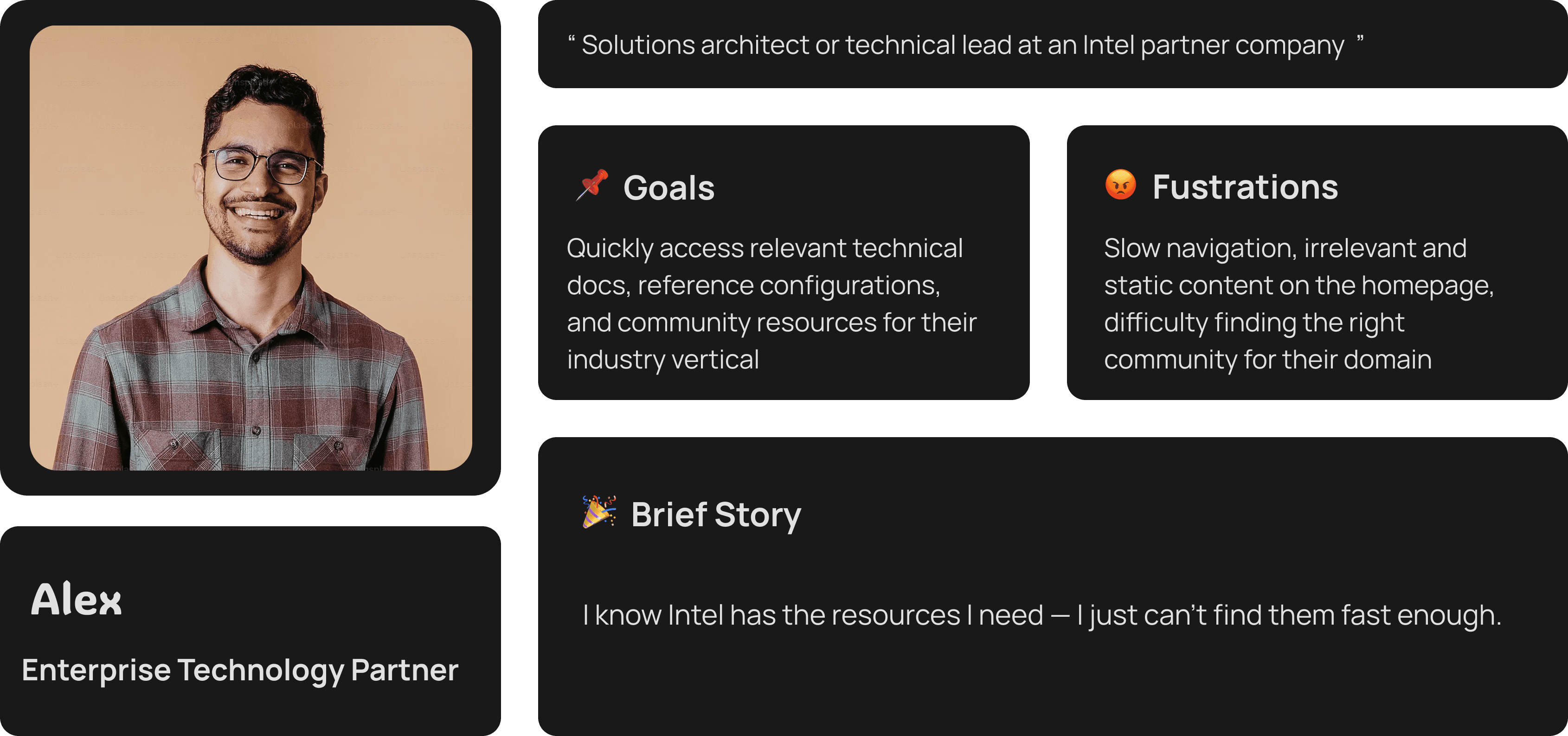
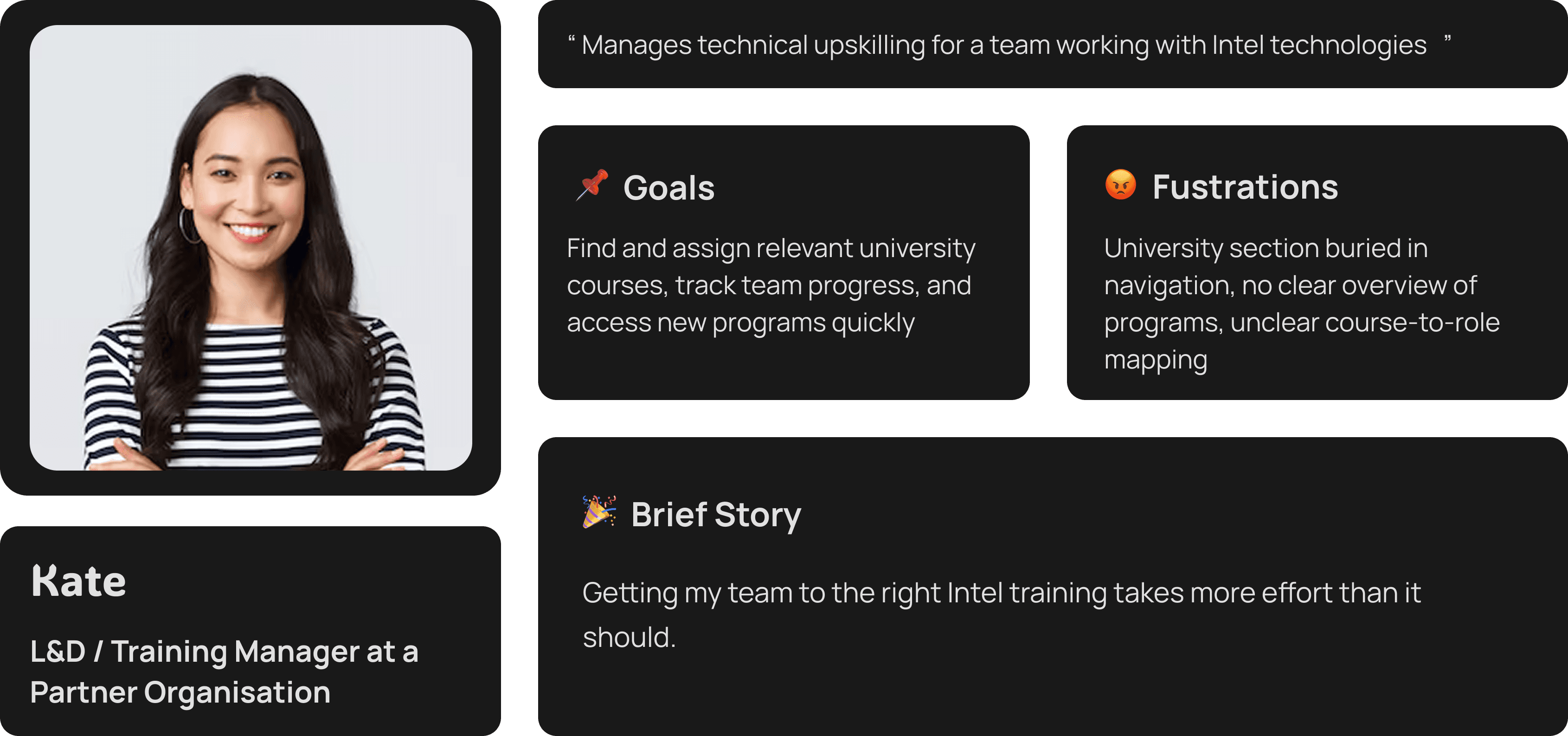
User Personas
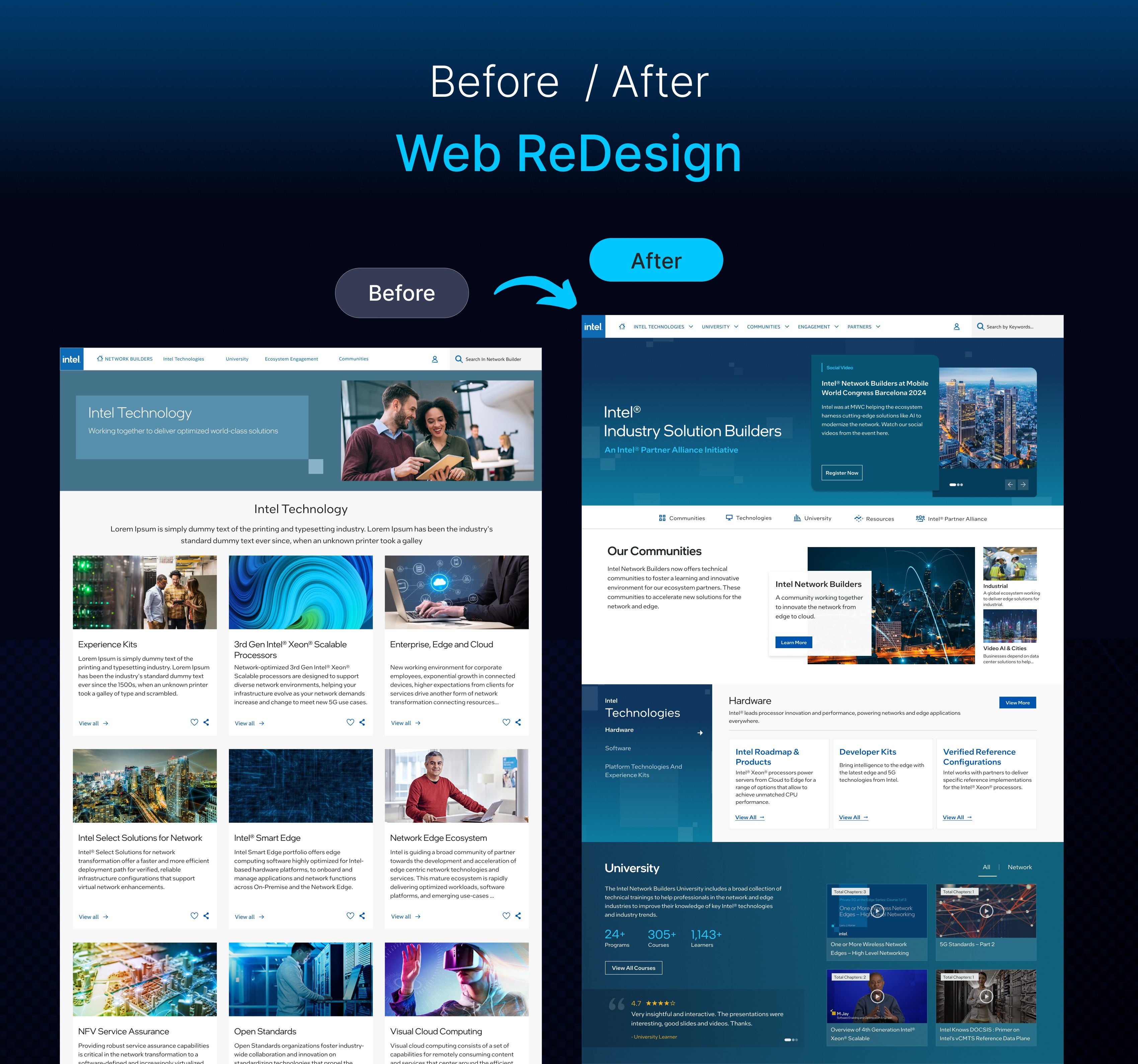
Before vs. After — Key Changes

Area | Before | After |
Homepage | Static, fixed content. No dynamic updates or featured content. | Dynamic content surfaces: featured articles, partner spotlights, events, and community highlights. |
Navigation | Flat, inconsistent nav with no clear hierarchy between communities and tech. | Restructured global nav with clear separation of Technologies, University, Communities, Engagement, and Partners. |
Community Pages | Each community designed independently — inconsistent patterns and depth. | Unified community template with consistent layout, entry points, and cross-community navigation. |
Resource Discovery | Technical docs, courses, and webinars siloed in different sections. | Integrated resource surfacing across the homepage, community pages, and a redesigned document library. |
Visual Design | Outdated UI misaligned with Intel's current brand and competitive positioning. | Modernised, accessible UI aligned with Intel brand standards — clean, structured, enterprise-grade. |
University | Hard to find, limited course overview, no clear program structure. | Prominent University hub with program categories, course previews, and learner testimonials. |
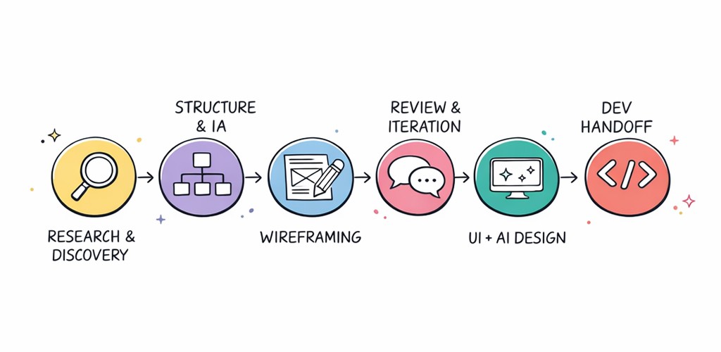
Design Process
I structured the project across five phases, moving from discovery and audit through to a tested, live product. Each phase built on the last — decisions made in IA directly shaped wireframe structure, which shaped the final UI.
Phase 1 — Research & Analysis
Conducted a full heuristic audit of the existing site against usability principles.
Mapped the existing IA — every page, section, and navigation path — to identify structural gaps.
Ran competitive analysis of enterprise partner portals to benchmark patterns and expectations.
Synthesized findings into a prioritized problem list shared with Intel stakeholders for alignment.
Phase 2 — Information Architecture & Wireframing
Restructured the global navigation to reflect how users actually move between content areas.
Designed a unified page template for all five community verticals — consistent structure, flexible content.
Created low and mid-fidelity wireframes for all key page types: homepage, community pages, university, solution hub, document library.
Mapped new user journeys from homepage entry to resource discovery and community engagement.
Phase 3 — UI/UX Design Implementation
Applied Intel brand guidelines across all redesigned surfaces while modernizing layout density and hierarchy.
Designed dynamic content modules for the homepage — featured articles, events, partner spotlights, community tiles.
Built a responsive design system ensuring consistency across desktop and tablet breakpoints.
Delivered 7 distinct page designs with annotated component specifications.
Phase 4 — Development & Integration
Collaborated closely with the development team during build — providing design QA and resolving implementation questions.
Ensured responsive behaviour, accessibility considerations, and interaction states were implemented correctly.
Phase 5 — Testing & Launch
Conducted design review sessions with Intel stakeholders before final sign-off.
Launched with an onboarding guide to help existing partners navigate the new structure.
Monitored initial partner feedback post-launch to identify quick-win improvements.
Key Design Decisions
Decision 1
Unified community template instead of individually designed pages
The problem: Each of Intel's five community verticals (Network, Industrial, Retail, Healthcare, Video & AI Cities) had been designed separately, creating an inconsistent and fragmented experience for partners who worked across multiple verticals.
What we tried: Designing each community page independently to preserve their distinct identity.
What we shipped: A single flexible community template with consistent layout zones — hero, featured content, solution categories, member spotlight — applied uniformly across all five verticals.
Why: This created immediate recognition when moving between communities, reduced design and development effort significantly, and made future community additions straightforward to scale.
Decision 2
Dynamic homepage content model over a static layout
The problem: The homepage showed fixed content that was never updated, making the platform feel stale and reducing reasons for partners to return regularly.
What we tried: A refreshed static homepage with better visual design but the same fixed content model.
What we shipped: A modular, dynamic homepage built around editable content zones: featured article rotator, upcoming events, community highlights, partner spotlights, and latest resources.
Why: This transformed the homepage from a one-time gateway into a reason to return — keeping the platform current and relevant without requiring a redesign each time content changed.
Decision 3
Integrated resource discovery instead of siloed sections
The problem: Technical documents, university courses, solution briefs, and webinars were all housed in separate sections with no cross-linking — making it nearly impossible for partners to discover related resources organically.
What we tried: Improving search functionality within each individual section.
What we shipped: Resource modules embedded directly within community pages and the homepage, surfacing contextually relevant documents, courses, and webinars where partners were already spending time.
Why: Partners no longer needed to know where content was stored — the right resources appeared in the context of the content they were already reading. This was the primary driver of the 40% improvement in resource discoverability.
Final Solution
The redesign covered seven primary page types, each solving a distinct problem identified in the discovery phase.
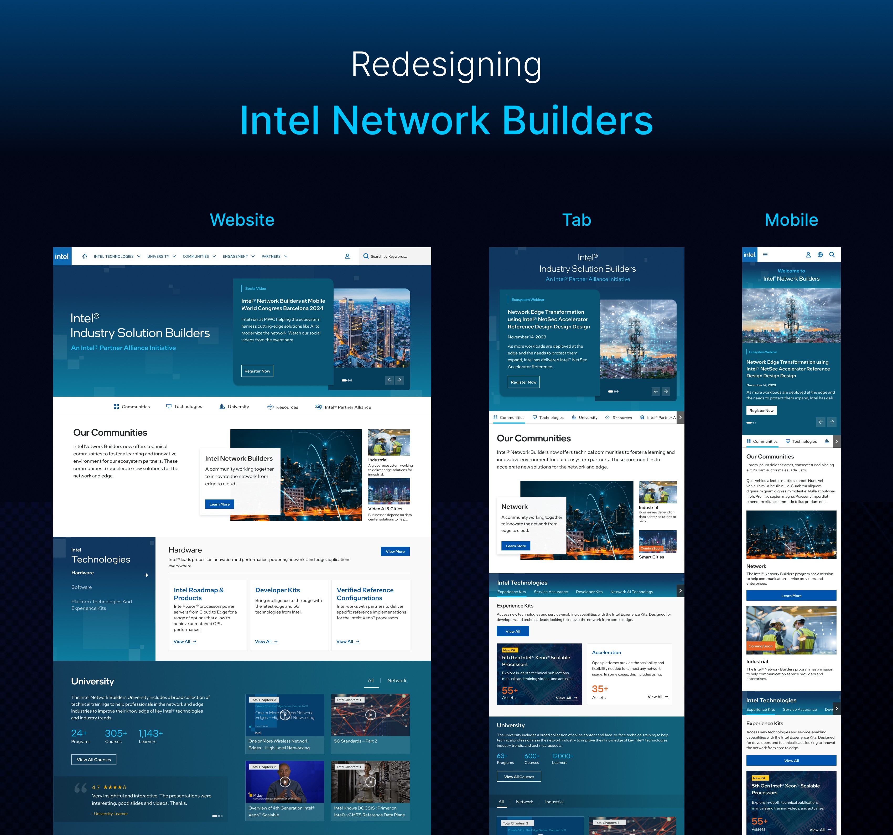
Homepage | Dynamic, modular layout surfacing featured content, community entry points, events, and partner spotlights. First point of contact — rebuilt to create a reason to return. |
Community Pages (×5) | Unified template applied across Network, Industrial, Retail, Healthcare, and Video & AI Cities. Consistent structure with flexible content zones per vertical. |
Technologies Hub | Restructured to clearly separate AI Technology, Hardware, and Software — with direct paths to specific products, toolkits, and reference implementations. |
University | Prominent, accessible hub showcasing 26+ programs and 290+ courses. Clear program categories, course previews, and learner social proof. |
Solution Hub | Redesigned Systems and Applications catalog with improved filtering, card layouts, and direct links to partner solutions and Edge AI resources. |
Document Library | Improved browsing and filtering for solution briefs, white papers, and product briefs — with contextual surfacing across community pages. |
Partners / Members | Clearer partner directory across all five community verticals with improved role-based navigation for Communication Service Providers. |
Results & Impact
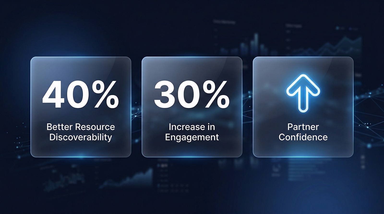
40% | 30% | ↑ |
Better Resource Discoverability | Increase in Engagement | Partner Confidence |
Partners could find technical docs, courses, and solutions significantly faster after the navigation overhaul. | Redesigned community pages and dynamic content surfaces drove measurably higher interaction across the platform. | Stakeholder and partner feedback confirmed the new experience better reflected Intel's enterprise positioning. |
Qualitative Outcomes
Intel stakeholders confirmed the new design better reflected enterprise positioning and partner expectations.
Partners navigating between communities reported a significantly more coherent and connected experience.
The dynamic homepage model gave the Intel content team a sustainable way to keep the platform current without engineering involvement.
The unified community template became a reusable foundation — any new community vertical can now be launched using the same structure.
University discoverability improvements contributed to measurably higher course access and program awareness among partner teams.
Learnings & Reflection
What worked well
Starting with a structured IA audit before touching visual design meant every layout decision had a clear rationale. Navigation improvements drove the majority of the measurable outcomes.
Creating a unified community template early set a consistent foundation that made designing all five verticals far more efficient — and the result felt like one coherent product rather than five separate sites.
Embedding resource discovery within community pages rather than isolating it in a separate section was the single highest-impact structural decision.
What I'd do differently
Conduct more direct research with actual Intel partner users — not just stakeholders — to validate navigation assumptions before committing to the final IA.
Define a formal content governance model earlier in the project, so the dynamic homepage modules had clearer editorial ownership post-launch.
What this project taught me
Enterprise platforms often suffer from accumulated complexity rather than a single design failure. The most valuable design work here wasn't creating new features — it was removing structural friction that had built up over years. On large-scale redesigns, navigation architecture and content discoverability deserve as much design rigour as the visual interface.
Client
Intel
Stack
Figma, Photoshop Chatgpt
Timeline
4+ Months
Year
2024

Visuals
See also

wzdm.ai
An AI-powered enterprise LMS to help teams learn, grow, lead, and manage learning programs faster.

OnSumaye AI
Making AI agent customization easy for non-technical users

OfferYard Marketplace App
End-to-end UX for buying, selling & auction flows

OnSumaye
Corporate redesign + AI solutions showcase launch