Product
AI
SaaS

About the project
Problem
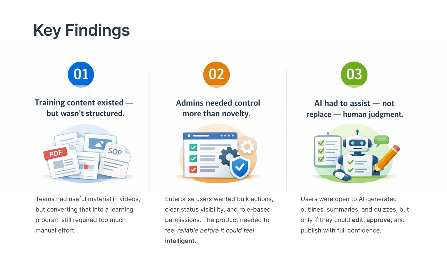
Fragmented Content. Slower Onboarding. Inconsistent Learning.
Enterprise teams had training content spread across documents, decks, SOPs, and manually maintained course assets — making it difficult to create learning programs quickly, keep them updated, or maintain consistency across teams.
The business impact was clear: content creation slowed onboarding and compliance training, admins spent excessive time managing learning assets, and learners regularly faced fragmented, confusing pathways.
My Role
Ownership | UX strategy, product IA, workflow design, research synthesis, AI-driven functional prototyping in Figma Make, prompt engineering for AI-assisted flows, accessibility considerations, and developer handoff using exported code. |
Collaboration | Founders, product leadership, engineering, and customer-facing teams (sales, implementation, and support). |
Outside my scope | Engineering implementation. |
As the sole designer on the project, I wasn't only designing screens — I was shaping product logic, system behaviour, and the interaction model end to end.
Research & Discovery
Methods Used
Competitive analysis of enterprise LMS and learning platforms
Heuristic evaluation of early product concepts
Workflow review of real training and onboarding use cases
Iterative design discussions with engineering and the product owner
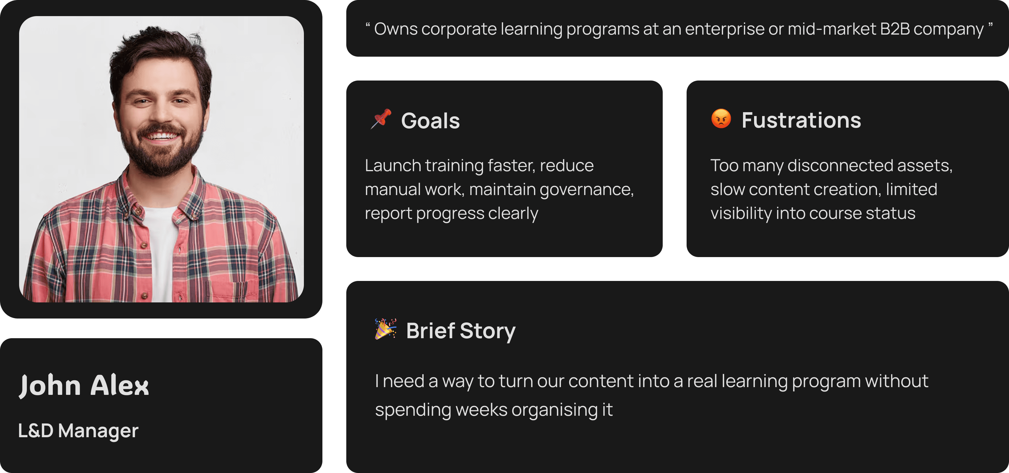
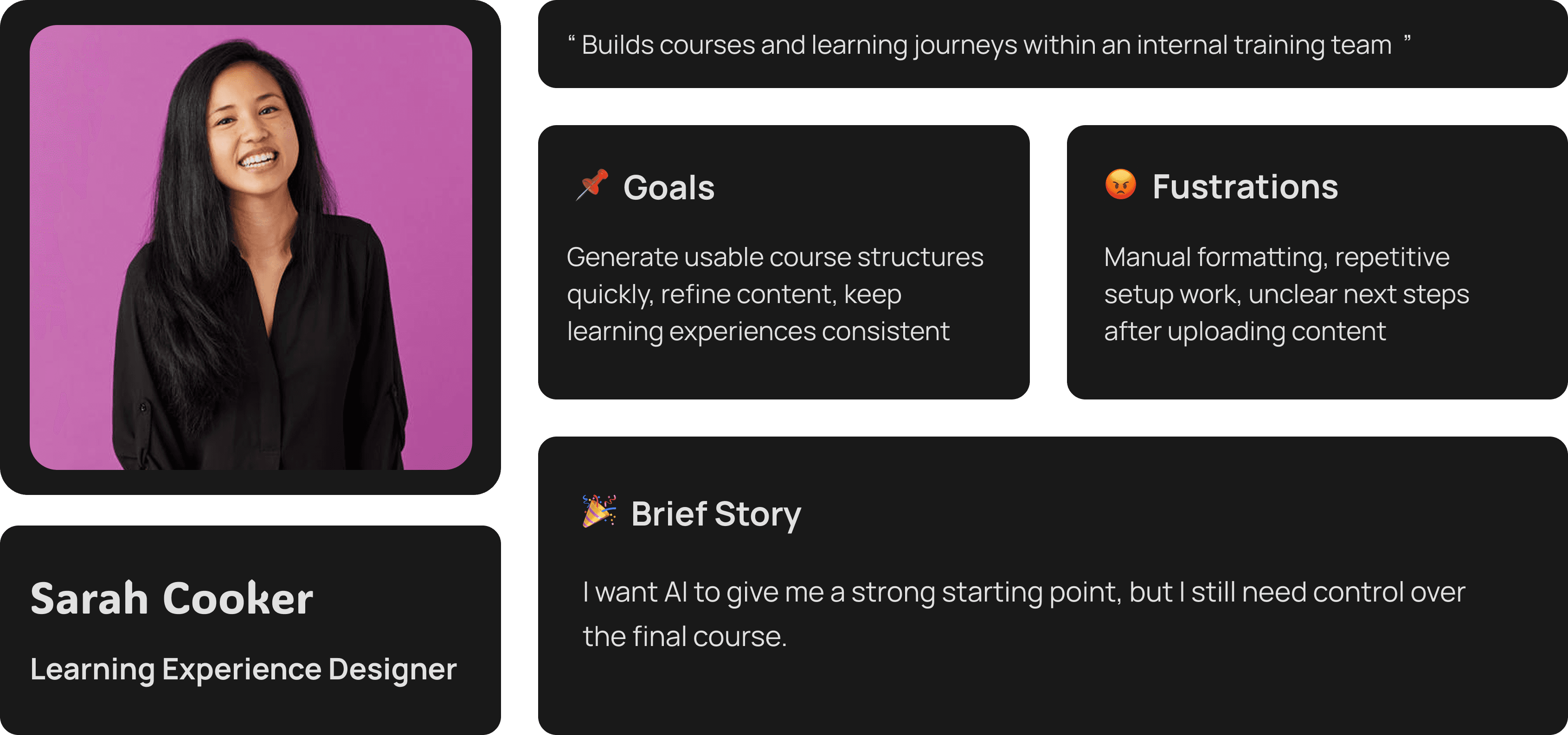
User Personas
User Journey & Flow
Core flow across all user types:
Content Source → AI Structure Generation → Human Review → Pathway Assignment → Publish / Approval → Learner Access → Reporting
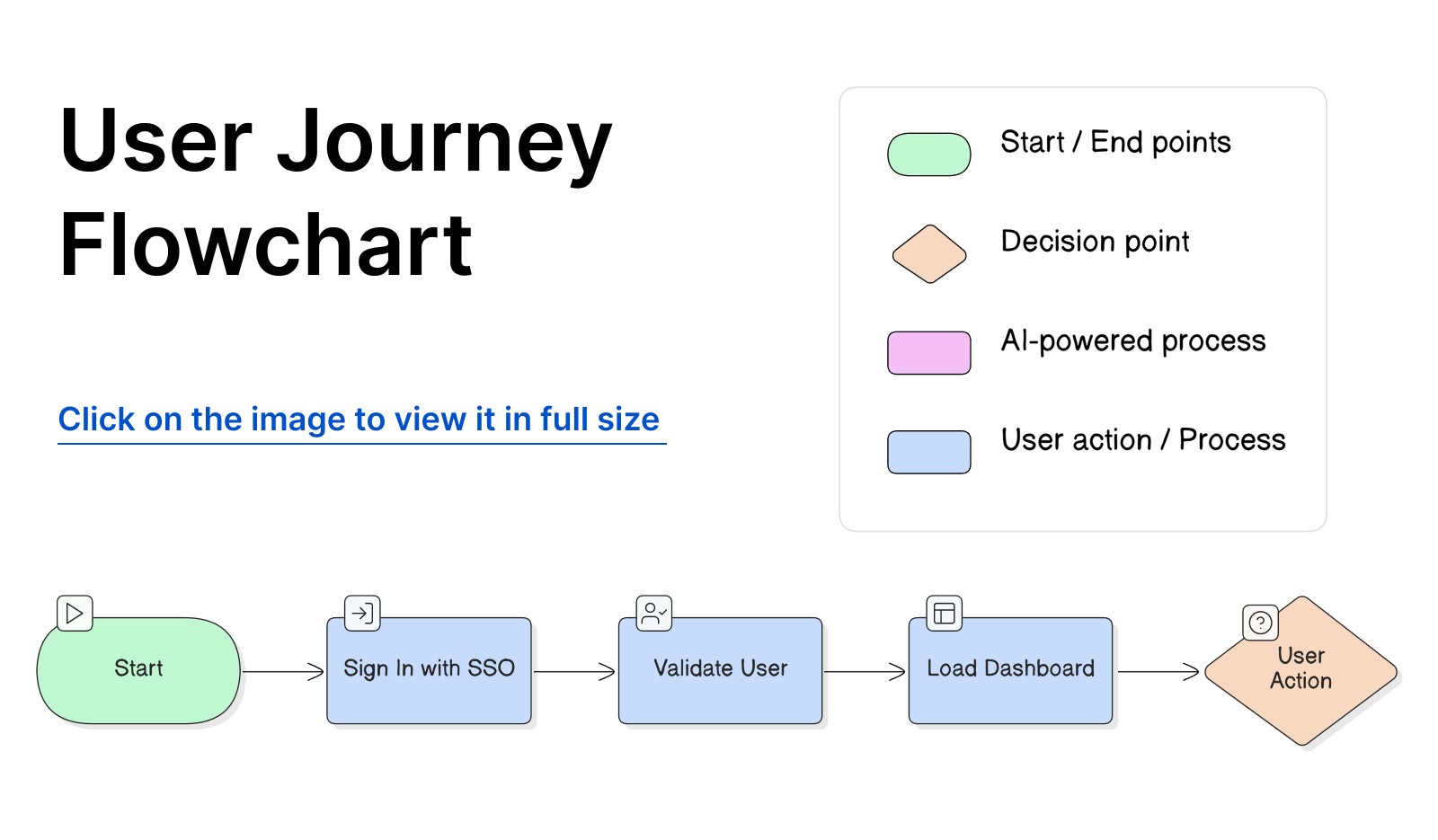
The product is designed around a guided system rather than an open-ended editor. That structure was critical because enterprise training needs consistency, auditability, and clear ownership at every stage.
Key Insights by Stage
Content Source — Most orgs already had content; the friction was in structuring it, not creating it from scratch.
AI Generation — Users needed to see the draft output immediately after upload to understand what the AI could do.
Human Review — This was the highest-trust moment. Editable, rejectable AI suggestions made the system feel safe.
Publish / Approval — Role-based gating here protected enterprise governance without adding unnecessary complexity.
Learner Access — Simplicity was paramount. Learners needed a guided, self-serve experience with contextual support.
Design Process
I approached wzdm.ai as a product system, not a visual UI exercise. The core challenge: make the product feel fast and AI-assisted without sacrificing the control and predictability enterprise teams require.
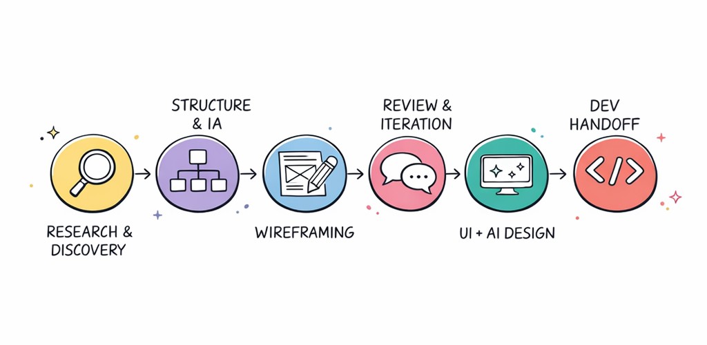
Phase 1 — Structure First
I started by mapping the full experience across three roles: Admin / L&D owner, Course creator, and Learner. This separation clarified what each user needed to see, what they needed to do, and what should never be exposed to them.
Phase 2 — Wireframing Decisions
Early wireframes focused on:
A clear Program → Course → Chapter → Quiz hierarchy
A simple upload-to-next-step flow to eliminate post-upload dead ends
Visible publishing states and draft management
Bulk operations for large content catalogs
Learner preview and inline AI support triggers
Phase 3 — Iteration & Refinement
As the design matured, key friction points were addressed:
Upload success needed to lead to a clear next action, not a passive confirmation
AI-generated suggestions needed to be inline-editable without leaving the current screen
Publishing needed role-based gating as a first-class feature, not an afterthought
Admin dashboards needed to support fast scanning and bulk management at scale
Phase 4 — Final UI Direction
The final interface balanced structure and flexibility. A clean data-heavy SaaS layout, with AI features introduced practically, not experimentally. Enterprise users needed to trust the system before they could enjoy it.
Key Design Decisions
Decision 1
Structured hierarchy over free-form creation
The problem: Enterprise learning content becomes difficult to track and scale when created as isolated pages or loose assets.
What we tried: Flexible content blocks and open-ended authoring patterns.
What we shipped: A clear hierarchy: Program → Course → Chapter → Quiz.
Why: This structure made reporting, governance, and learner progression consistent. It also gave the AI a stable framework to generate content into — every AI output had a predictable home.
Decision 2
Two-step post-upload action instead of a vague success state
The problem: After uploading content, users had no clear next step — causing abandoned drafts and lost momentum.
What we tried: A standard upload-complete notification with no follow-on action.
What we shipped: A clear success screen with two primary paths: Edit metadata & add to pathway, or Publish & go to pathway.
Why: This turned a passive confirmation into an active decision point and directly reduced abandoned drafts.
Decision 3
AI suggestions with human review baked in
The problem: AI can accelerate content creation, but enterprise teams cannot afford to lose quality control.
What we tried: Direct auto-generation with minimal review before publishing.
What we shipped: AI-generated structure, summaries, and quizzes that could be reviewed, edited, accepted, or rejected before anything was saved.
Why: This created genuine trust. Users could move faster without feeling that the system was making final decisions on their behalf.
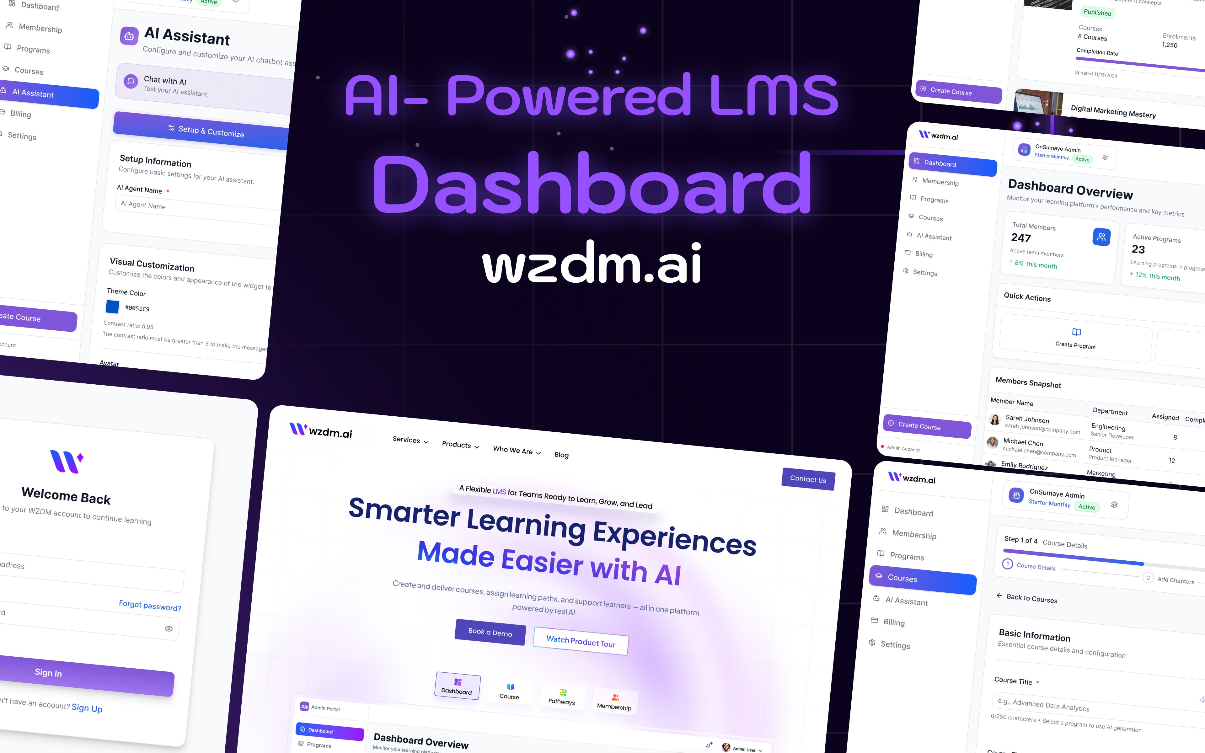
Final Solution
wzdm.ai was designed as an AI-first enterprise LMS supporting the complete lifecycle of learning content: creation, structuring, publishing, learner access, and reporting — all within a single, governed system.
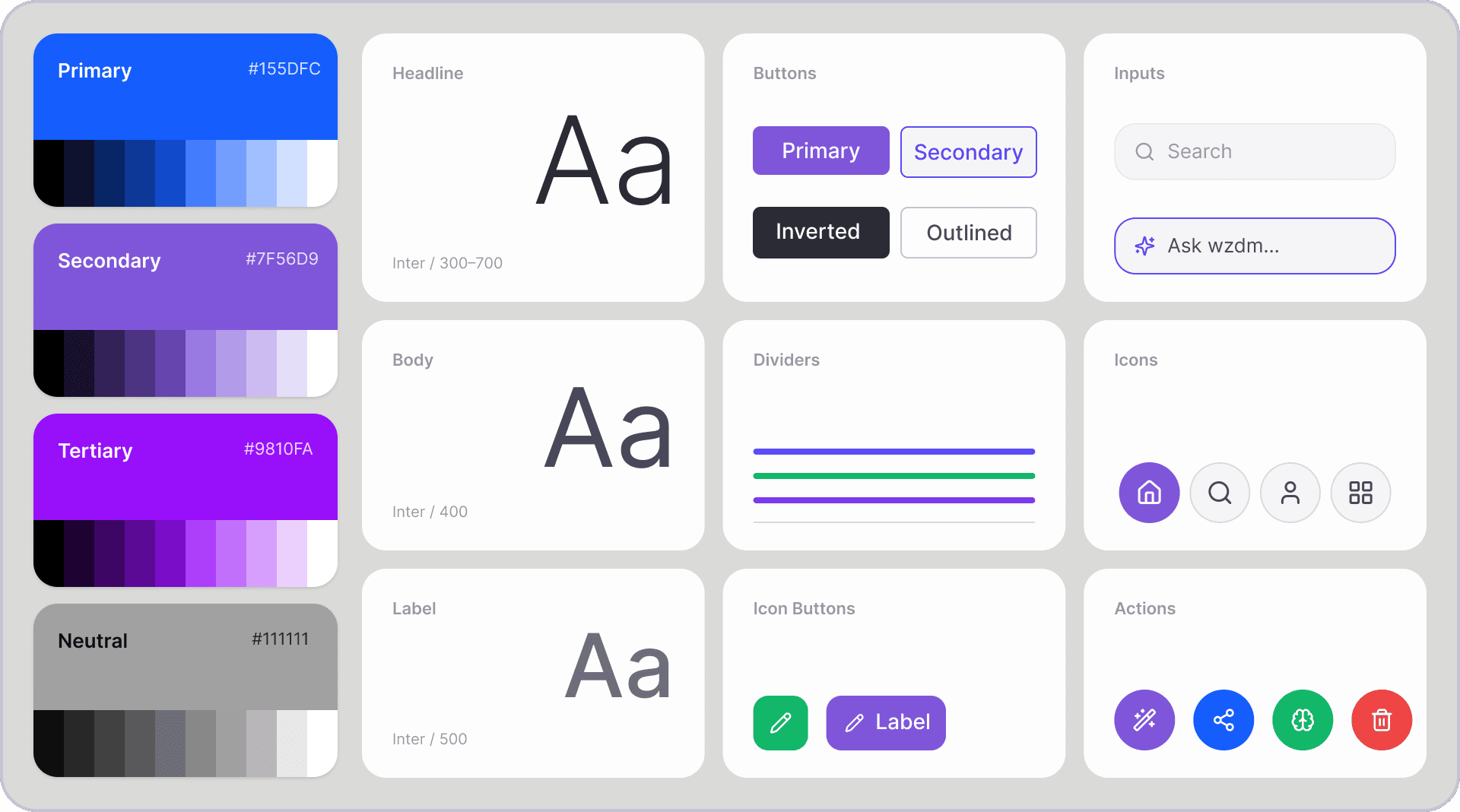
Style Guidelines
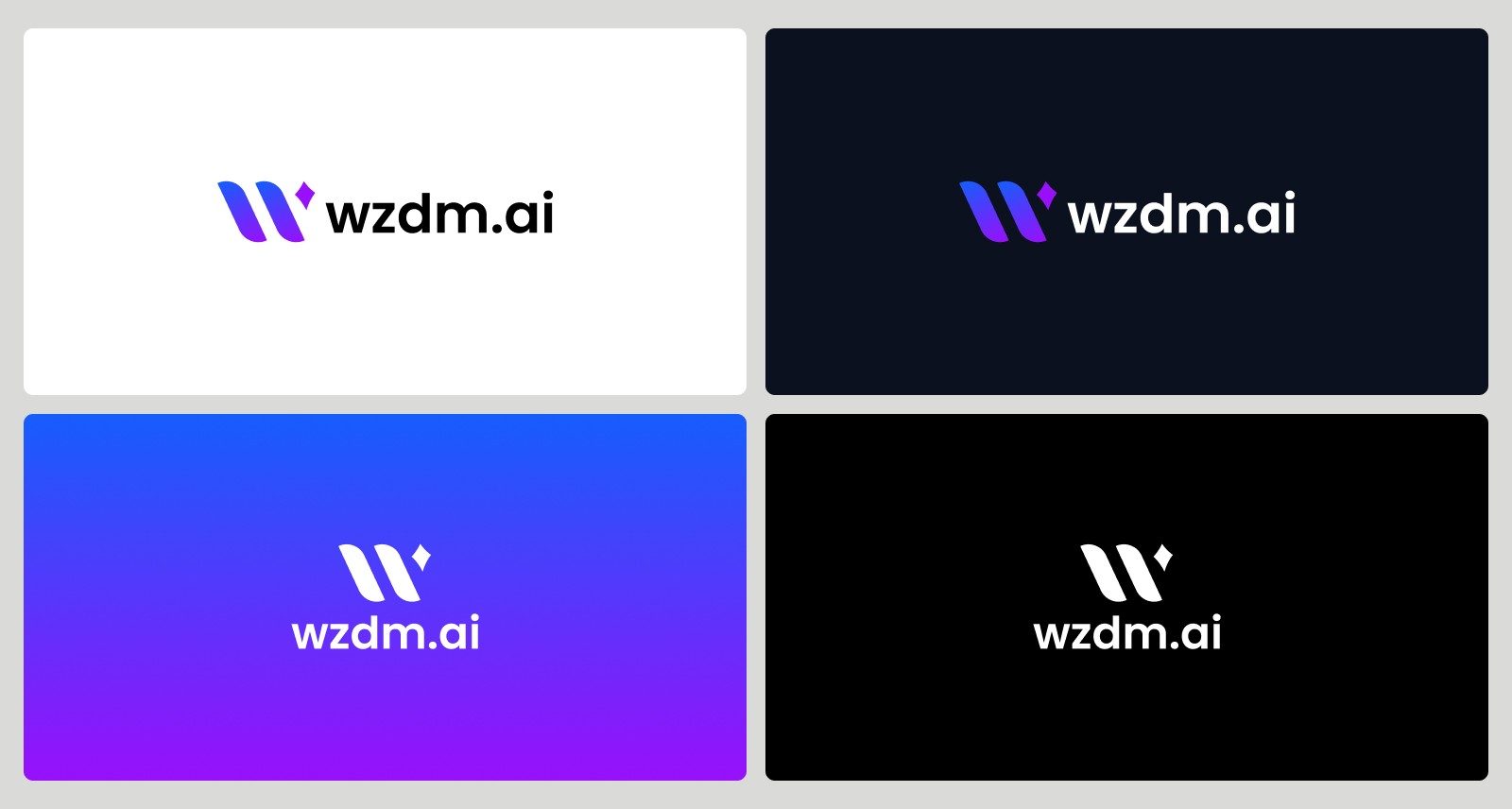
Logo Design
Scroll down to view all screens.
Results & Impact
Content Discoverability | Course Creation Speed | Lower Support Load |
Stronger structure made it easier for teams to find, edit, and manage learning assets across the platform. | AI-assisted authoring workflows significantly reduced the manual setup time per course. | Clearer post-upload flows and governance patterns reduced user confusion and follow-up questions. |
Qualitative Outcomes
Stakeholder confidence in the product increased significantly during demos and review sessions.
Teams could understand and navigate the system faster — onboarding to the tool itself was reduced.
The AI workflow was described as practical rather than experimental by implementation partners.
Admins had a more reliable, structured way to manage growing learning content catalogs.
Learnings & Reflection
What worked well
Designing the product as a system — not isolated screens — made the experience easier to scale and kept every decision consistent.
Defining the Program → Course → Chapter → Quiz hierarchy early gave the entire product a stable foundation.
Keeping AI assistive rather than fully automated made the product significantly more trustworthy for enterprise users.
What I'd do differently
Validate AI prompt templates and output structure even earlier with real sample content from target users.
Add comparative analytics between draft creation, review behaviour, and publish rates from day one.
Document design decisions more formally in the handoff — not just screen specs, but the rationale behind system behaviour.
What this project taught me
Strong enterprise UX is not just about a polished interface. It is about designing a product that supports structure, trust, scale, and operational complexity — all at the same time. When those four things are in tension, structure and trust must come first.
Client
OnSumaye / wzdm.ai
Stack
Figma · Figma Make Photoshop ChatGpt · Claude
Timeline
3+ Months
Year
2025


Visuals
See also

Intel Network Builders
40% better resource discoverability after redesign

OfferYard Inc
End-to-end UX for buying, selling & auction flows

OnSumaye AI
Designing a no-code AI agent builder that lets any business deploy custom, data-trained AI assistants — without writing a single line of code.

OnSumaye
Corporate redesign + AI solutions showcase launch